roughs from The Christmas Donkey - Scholastic 1993
Wednesday, 24 December 2014
Wednesday, 10 December 2014
AGMs
I’m not generally very keen on AGMs which can have boring financial
reports and lengthy digressions and interruptions from the floor, but I was
pleasantly surprised by the recent AGM of the Authors’ Licensing and Collecting
Society. I might have guessed it was worth attending from the number of authors
there.
So what did ALCS do differently to attract so
many people? Well there was the interesting venue: the art deco Radio Lecture
Theatre at BBC Broadcasting House, with its Eric Gill friezes, plus a welcome
from creative director, Alan Yentob and the opportunity, at the end, to go on a
tour.
There was the concise and comprehensible
meeting, chaired by Adam Singer, with no off –the– point interruptions. If a
question did threaten to hold up proceedings, there was the promise to talk further with Adam Singer at the reception afterwards.
There was
entertainment: a special guest speaker, radio and television writer, Stephen
Wyatt who gave a great talk about radio drama.
And finally, there
was a generous spread of food and drink.
So what did I
learn? That ALCS, together with the Publishers Licensing Society (PLS), is a
joint owner of the Copyright Licensing Association (CLA) and they are now all
under the same roof, in premises in Holborn. That for 12 years the ALCS fund has
been increasing and now stands at 33 .8 million; that authors have a powerful
organisation lobbying for them to find new ways of remuneration in the digital
age when the old way - photocopying – is declining. And finally, that
illustrators needn’t worry either, as their collecting society, DACs, also uses the CLA
and works closely with ALCS in keeping an eye on new European directives.
So it was all
very reassuring and up- beat. I shall certainly be attending the next one!
Tuesday, 2 December 2014
BRANDS AND SERIES
Heffers bookshop, in association with the MA of Children’s
Book Illustration at Cambridge School of Art held a Festival of Illustration last
week and I was able to hear Axel Scheffler and James Mayhew talking about their
work.
If you go into any
bookshop you won’t fail to notice the Axel Scheffler/Julia Donaldson brand; created
out of the success of The Gruffalo, it
dominates the children’s section. So it
was interesting to hear Axel speak about his work. I’d heard him twice before
and wondered whether he had anything to add now he was a global success. But
the message was the same: his publisher would not allow him to deviate from the
brand and try anything new. Layout designs for his books were all done in-house
and it was impossible to argue with his publisher over any artistic decisions. As
a result Axel was bored. I’d heard him say that before but this time he was
able to be a bit more pragmatic and add that illustration was an applied art form,
he was part of a team and, after all, there was always an element of boredom in
any job.
‘Have you ever thought of getting a copy artist to do some
of the work for you?’ a student in the audience asked. Some illustrators would have
been insulted by the question but Axel just laughed and said it sounded a good
idea.
The following day,
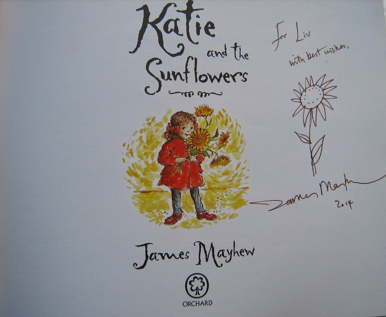
James Mayhew talked about his Katie series which is having a 25 year
anniversary.
This series, published by Orchard arose out of James' childhood love of
paintings - paintings like John Constable’s Hay Wain - and a desire to make art galleries imaginative
and inspiring places. James based his character Katie on his sister as he
remembered her as a little girl. Katie has adventures when she steps into pictures
she sees hanging in an art gallery. It was the publisher’s idea to have photos
of the pictures with a frame drawn by James.
Despite being aimed at a niche market, the series took off and Orchard took control, saying where Katie went next and asking for more and more Impressionist paintings because they were the most popular.
Despite being aimed at a niche market, the series took off and Orchard took control, saying where Katie went next and asking for more and more Impressionist paintings because they were the most popular.
“I couldn’t always do what I wanted with my own character,”
James said sadly.
For the 25th
anniversary, Orchard created new covers for all the books with a title frame
that James thinks looks just like a Cath Kidston soap label. I’m sure that was
exactly what it was meant to look like because of the popularity of the Cath Kidston
brand. Like Axel, James admitted he found it hard to argue with his publishers
but after 25 years of Katie, he said he was planning to take a break and do
something different. He said the reward of working on the Katie books was
seeing how children responded to them. It’s no mean feat, painting in the style
of all those great masters, but now James wants to be himself, not Van Gogh,
Gauguin or Monet.
Clearly there will
always be a point of conflict in the applied art of illustration between the
illustrator’s desire for creative freedom and business constraints imposed by
the publisher.
Subscribe to:
Comments (Atom)


