Featured post

PAM ROYDS 1924 - 2016

Pam Royds on Grasmere , 1971 with Sally Christie, children’s author and daughter of Philippa Pearce. I was just twenty two when I fir...

About Me

My photo
United Kingdom
My blog is about writing and illustrating children's books which I have been doing since 1974. www.gillianmcclure.com has all my books. I also have another blog: www.paulcoltman.blogspot.com where I publish my father's poems.

Sunday, 22 February 2015

MOTHER/FATHER -DAUGHTER COLLABORATIONS - in conversation with Joyce Dunbar


Gillian McClure and her father Paul Coltman and their book Tinker Jim in 1992


G: I remember that the collaboration with my father, Paul Coltman, on three picture books TOG THE RIBBER, WITCH WATCH and TINKER JIM, all published by Andre Deutsch and Farrar Strauss & Giroux in the late 1980s and early 1990s felt rather unique at the time, but you’ve done the same thing, Joyce, with your daughter, Polly Dunbar.

J: There aren't many such parent/child collaborations about.
Polly showed early promise. From the age of 5 onwards her Christmas present to me was a tiny picture book she had made. I saved them all - Polly has them now. I was working on books with my husband at the time. I didn’t dream that I would one day work with Polly. It all seemed so far away.

G: Polly must have been a similar age and stage in her career as I was when she illustrated your story, SHOE BABY published by Walker Books in 2005. Did you do anything together before that?

J: Polly was 16 when she published two books of cartoons about teenage life in Norwich.
followed by 4 novelty books.  Then, in 1998 we were asked to do a book for the Family Contact Centres - a place where estranged parents could meet their children on neutral territory (now dismantled of course). This was unpaid, but a great way to start a collaboration.

G: But a big difference between our two collaborations was that my father had always been a poet rather than a writer for children so it was me introducing him to the world of picture books whereas you were already a well established author of picture book and didn’t you share the same publisher as Polly? So was it your idea or your publishers that you should work together on a book? How did it all come about?

J: One day I caught a glimpse in Polly’s sketch book of an old woman stepping over a field of shoes. 6 years later, after many rewrites,  this became SHOE BABY. Polly had already published DOG BLUE & FLYWAY KATIE  with Walker so was well versed in the picture book format, and they took it on. With her student friend Katherine, Polly went on to make SHOE BABY into a puppet show - the start of  Longnosepuppets. The show won first prize at the Brighton festival in 2006 and has been on tour ever since.

G: Like Polly, I’m both writer and illustrator and I found that I was not just illustrating but involving myself in the text as well. This didn’t happen with the first book, TOG THE RIBBER, which was a poem my father had written several years before and it just happened to fall neatly into the 32 page format of a picture book. However, with the next two, WITCH WATCH and TINKER JIM, I worked closely with my father on the text alongside the illustrations as he didn’t ‘think in picture book format.’ Did Polly ask for any changes in your texts?


J: Not for SHOE BABY - where unusually, not a word was changed. However, for PAT -A CAKE BABY -  she was trying out new techniques and had this ingenious notion of making the words part of the pictures. This meant cuts and changes. We had a lot of fun - and sweat - working it out. Because we have a shared sensibility in some ways, it feels like a book by two people rolled into one rather than two separate individuals - a special pleasure for me  because I would love to have been an illustrator as well as a writer. Every publishers dream is the person who can do both.


G: And equally, did you make any suggestions at the rough stage of her illustrations? Or maybe that was all left to the designer at Walker Books? I remember sending the first roughs to my father rather than to the designer for, back in those days, there wasn’t the same close interaction with an in-house designer at the early layout stage of a picture book.

J:Polly worked closely with the designer, Liz Wood, and also with me. She showed me the dummies at each stage and I was allowed to comment. It’s a delicate balance and you have to be careful not to impose anything on the illustrator. Of course, I was just carried away by the sheer joyousness of Polly’s work so it was no problem.

 G: You’ve worked with many illustrators, Joyce, how did working with your daughter compare with other collaborations?

J: Well,  I don’t find many illustrators sitting on the end of the bed in the morning when I wake up; quite often you never even get to meet them. I take great care to keep out of it until Polly is ready to show me. I worked very closely with James Mayhew on the MOUSE & MOLE series, but never interfered or gave instructions. That is a no-no. More usually the publisher sends me the dummies at different stages for comment. The special thing is that we each know where the other is coming from.

G: When my father and I first worked together, I remember Dad finding the whole process of illustration very slow (I was juggling it with a new baby and a house move) and he would keep phoning to try and hurry it along. I expect you’re much more understanding of illustrators and deadlines, Joyce.

J: I never hurry it along, especially now that I have to wait in a long queue while Polly is working on other books.  You have to leave the illustrator to get on with their side of the dance. You are equal partners - except that I do think the illustrator makes or breaks the text. In this case, the illustrator is the inspiration for the text, and the incentive. Without Polly, neither of these texts would ever have been written. I can’t hurry myself along. I had the idea - but couldn’t make it work. Then one day Polly was ill in bed with flu and she did some sketches of these tiny candy babies making a cake - with outsize rolling pins and so on. I knew then that I had to make it work - but it was another 6 years and mountains of scribble before the text was acceptable. Now it all looks so simple.


G: The collaboration with my father ended when Andre Deutsch’s children’s list was bought by Scholastic and David Fickling, our new editor, turned down the fourth book, Proteus, Guardian of the Seals.  This eventually somehow morphed itself into quite a different seal legend, SELKIE and I returned to being both author and illustrator. Your collaboration is not yet over, though, and you have a new book coming out…

J: PAT-A-CAKE BABY comes out in April. There is something so exciting to children about making a cake - so I wanted the words to capture all the fizz and feel and frolic of the process. Polly has taken this as far as it can go - to HULLA-BALLOONY-MOONTIME. The
words, like the cake, seem edible.

Polly Dunbar and her mother Joyce Dunbar and their new book PAT-A CAKE BABY 2015

Tuesday, 10 February 2015

RADIO PODCAST


I was recently interviewed by Leigh Chambers for Bookmark on Cambridge 105 along with Kevin Crossley-Holland talking about myths and Lauren Trimble talking about the digital magazine 'Offline.'
You can listen to it by the podcast on this link:


Sunday, 18 January 2015

TREASURE ISLAND

I recently bought a copy of Robert Louis Stevenson’s Treasure Island published in 2009 by Walker Books, with pictures by John Lawrence, pictured here in his studio signing it.

John's Treasure Island is very different from the edition I had as a child, published in 1927, with pictures by Edmund Dulac.
I remember having a fearful fascination for old blind Pew. This must have come from Stevenson’s words for when I looked again at my Dulac illustration of Pew, it was not the image above that had worked on my imagination.

John Lawrence’s Pew, on the other hand, does impact on the imagination.

The strong black line reminds me a bit of Roland Hilder’s Treasure Island, published by Oxford University Press in 1944. 


I particularly love this image of John’s. The bold line makes it more eye catching than the one I grew up with:

though I’ve always loved the perspective in this Dulac illustration.

Both Roland Hilder and John Lawrence include illustrated chapter headings whereas my Dulac edition just has the coloured plates.

John is a real craftsman – working meticulously with etching, lino prints and collage. Here, he is showing me the etching plates and lino cuts of the illustrations he is working on at the moment; a factual book about crocodiles. I can’t wait to see it published.


Wednesday, 10 December 2014

AGMs


I’m not generally very keen on AGMs which can have boring financial reports and lengthy digressions and interruptions from the floor, but I was pleasantly surprised by the recent AGM of the Authors’ Licensing and Collecting Society. I might have guessed it was worth attending from the number of authors there.
     So what did ALCS do differently to attract so many people? Well there was the interesting venue: the art deco Radio Lecture Theatre at BBC Broadcasting House, with its Eric Gill friezes, plus a welcome from creative director, Alan Yentob and the opportunity, at the end, to go on a tour.
     There was the concise and comprehensible meeting, chaired by Adam Singer, with no off –the– point interruptions. If a question did threaten to hold up proceedings, there was the promise to talk further with Adam Singer at the reception afterwards.
    There was entertainment: a special guest speaker, radio and television writer, Stephen Wyatt who gave a great talk about radio drama.
    And finally, there was a generous spread of food and drink.
So what did I learn? That ALCS, together with the Publishers Licensing Society (PLS), is a joint owner of the Copyright Licensing Association (CLA) and they are now all under the same roof, in premises in Holborn. That for 12 years the ALCS fund has been increasing and now stands at 33 .8 million; that authors have a powerful organisation lobbying for them to find new ways of remuneration in the digital age when the old way - photocopying – is declining. And finally, that illustrators needn’t worry either, as their collecting society, DACs, also uses the CLA and works closely with ALCS in keeping an eye on new European directives.
    So it was all very reassuring and up- beat. I shall certainly be attending the next one!


Tuesday, 2 December 2014

BRANDS AND SERIES

Heffers bookshop, in association with the MA of Children’s Book Illustration at Cambridge School of Art held a Festival of Illustration last week and I was able to hear Axel Scheffler and James Mayhew talking about their work.

   If you go into any bookshop you won’t fail to notice the Axel Scheffler/Julia Donaldson brand; created out of the success of The Gruffalo, it dominates the children’s section.  So it was interesting to hear Axel speak about his work. I’d heard him twice before and wondered whether he had anything to add now he was a global success. But the message was the same: his publisher would not allow him to deviate from the brand and try anything new. Layout designs for his books were all done in-house and it was impossible to argue with his publisher over any artistic decisions. As a result Axel was bored. I’d heard him say that before but this time he was able to be a bit more pragmatic and add that illustration was an applied art form, he was part of a team and, after all, there was always an element of boredom in any job.

‘Have you ever thought of getting a copy artist to do some of the work for you?’ a student in the audience asked. Some illustrators would have been insulted by the question but Axel just laughed and said it sounded a good idea.
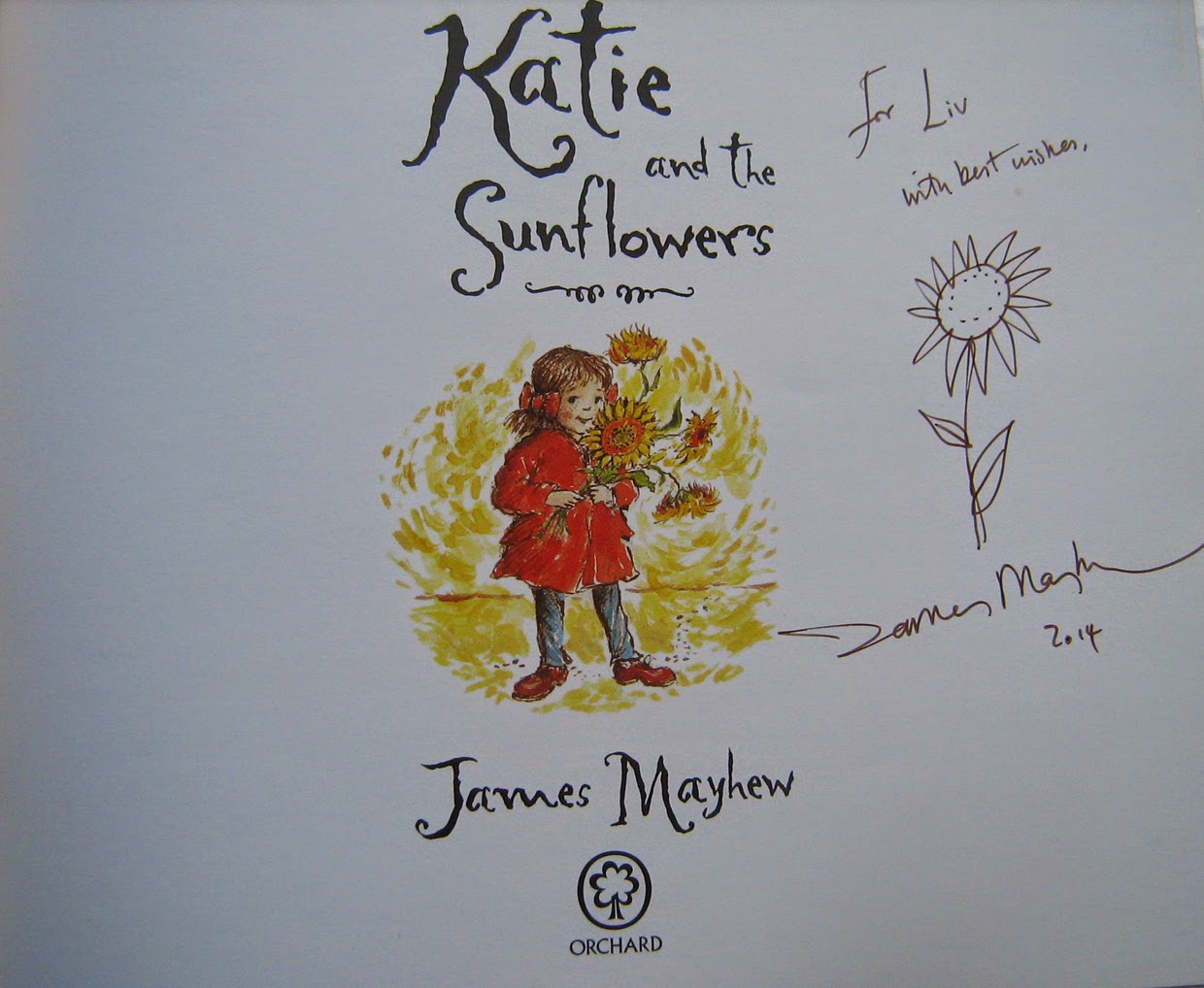
   The following day, James Mayhew talked about his Katie series which is having a 25 year anniversary. 

This series, published by Orchard arose out of James' childhood love of paintings - paintings like John Constable’s Hay Wain - and a desire to make art galleries imaginative and inspiring places. James based his character Katie on his sister as he remembered her as a little girl. Katie has adventures when she steps into pictures she sees hanging in an art gallery. It was the publisher’s idea to have photos of the pictures with a frame drawn by James.
    Despite being aimed at a niche market, the series took off and Orchard took control, saying where Katie went next and asking for more and more Impressionist paintings because they were the most popular.
“I couldn’t always do what I wanted with my own character,” James said sadly.

   For the 25th anniversary, Orchard created new covers for all the books with a title frame that James thinks looks just like a Cath Kidston soap label. I’m sure that was exactly what it was meant to look like because of the popularity of the Cath Kidston brand. Like Axel, James admitted he found it hard to argue with his publishers but after 25 years of Katie, he said he was planning to take a break and do something different. He said the reward of working on the Katie books was seeing how children responded to them. It’s no mean feat, painting in the style of all those great masters, but now James wants to be himself, not Van Gogh, Gauguin or Monet.
    Clearly there will always be a point of conflict in the applied art of illustration between the illustrator’s desire for creative freedom and business constraints imposed by the publisher.     

Thursday, 13 November 2014

A NEW LOOK FOR A NEW BOOK


Recently, a bookseller remarked on how different my picture books looked from each other. I suppose Plaister Press has given me the freedom to do one-off books rather than be brand or series led. By having all my in-print books now standing together on the Plaister Press bookshelf and not scattered among different publishers’ lists as they were in the past, there’s less of a need to make them all look alike just in order to be recognizable.  
   So I have been enjoying a different technique for each new book – glazing in Selkiea lot of waiting around with this process as each glaze has to dry naturally:

wet watercolour washes with colour dropped in and pigment tide-lines in The Little White Sprite and Zoe’s Boat -  always a bit chancy: 


waxing in We’re Going to Build a Dam - a sticky business:

and ink splattering in Flood – messy - I have to be outside to do this.


Now, with my latest picture book, I’m scratching. This needs a tough paper as I’m scratching with a dry pen nib while the paint is still wet. Arches 90lbs rough can take this.     
   Just as an author strives to find a new voice to fit the narrative of each new story, I like to do a similar thing with images. I search for a ‘look’ that matches the underlying feeling of a picture book story and that invariably means finding a new technique to best express it. 
    It’s not easy making each book look so very different from the last and as I embark on a new book there’s always a temptation to repeat the tricks of technique mastered in the previous one. I sometimes wonder whether, were a particular title to take off, the business side of me would put pressure on the creative side to follow it with a brand of very similar looking books. But that has not happened yet.