Featured post

PAM ROYDS 1924 - 2016

Pam Royds on Grasmere , 1971 with Sally Christie, children’s author and daughter of Philippa Pearce. I was just twenty two when I fir...

About Me

My photo
United Kingdom
My blog is about writing and illustrating children's books which I have been doing since 1974. www.gillianmcclure.com has all my books. I also have another blog: www.paulcoltman.blogspot.com where I publish my father's poems.

Tuesday, 24 May 2011

SCBWI TYPOGRAPHY WORKSHOP


Last Saturday was the typography workshop that Lisa Kirkham and I ran for SCBWI members. After a hairy drive through central London, when my Tom Tom lost the plot at a critical moment, sending  me the wrong way up various one-way streets and landing me in a bus lane - we arrived at a very peaceful venue in a secluded church building. The group was a talented one and we had a great discussion about the typographic design of the books we'd all brought along  - admiring Charlotte's Voake's hand done typeface and the way Emily Gravett's  hand written text in Little Mouse's Big Book of Fears was very much part of the illustration.
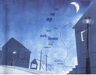
There's a lot of typographic fun and games going on in picture books today. We loved the girly type whenever 'girl pirates' were mentioned in The Night Pirates by Peter Harris and Deborah Allwright

and it was interesting seeing things from a professional typographer's point of view. Lisa is always thinking in terms of the movement of the reading eye; she spotted that 'Up, up up' on this page was in fact going down the page despite the decreasing size of each 'up' creating the perspective of going up.
   We found some books where the typographic design was over - the -top and didn't appear to have evolved with the image and text instead was arbitarily placed on the page.
   The workshop ended with a hands -on activity and then looking at the dummies people had brought along where a lot of thought had gone into the placement of text and image and the creative use of typeface .  


Sunday, 15 May 2011

SPRITE HOLES

After reading The Little White Sprite, a little boy in Canada is searching for sprite holes in Stanley Park. He thought he spotted two sprites on the day this photo was taken.


When I realised that children are fascinated by holes in trees and what lives inside them, I had this one made which I use with puppet characters in the workshops I give in schools and bookshops. There's going to be a Sprite workshop in Cambridge at Heffers Bookshop at 3 -4.30pm on 4 June.

Saturday, 7 May 2011

NEIGHBOUR

I'm soon to have a new next-door neighbour which has made me think of all the next-door neighbours I've had going back over the years to my childhood in West Sussex. Here's one I remember well, described in my father's poem Neighbour
and here's another who lived in a nearby chicken house:


Thursday, 21 April 2011

LED CREATIVELY BY THE BOOK

In his article 'Led Creatively by the Book' in the Carousel Guide, Chris Stephenson writes: 'The body and soul of a picture book - illustrations, text, type design - should all evolve together.’
This is exactly what I wanted to do when I started working with typographic designer Lisa Kirkham,
and The Little White Sprite, with the tree dominating the page lent itself to the close interlacing of twigs, typeface and story.
    Starting with a rough like the one above, where the text was all in a block, we would work together positioning it into a more organic shape –
We were coming from different directions and that was exciting. Whereas I was used to thinking broadly about the picture book’s overall rhythms – the punctuation of page turns to create pause and suspense in a story, Lisa’s decisions were informed by the reading movement of the eye.  The placement of text and type design was like a form of visual intonation with spaces for breaths.  
    For example, words in a sentence singled out and moved to another line, like ‘a hole’, catch the eye and are given emphasis. We had to decide whether the emphasis was appropriate for that bit of the story.  
Whereas I might find a particular pattern of text, like that on the right hand page above, pleasing to the eye, I was having to learn to use my ears as well as my eyes when it came to very precise placing of text. There was something too staccato about the line separation of the words ‘tugging’ and ‘at me’ and, in the end, we put them on the same line to lessen the effect.  
This is all very subtle and probably passes unnoticed by the reader, but if it contributes unconsciously to a harmony in the book between eye and ear, then it’s worth doing.
Lisa and I are giving a workshop, Creative Use of Typography in the Children’s Book on 21 May 2011 as part of the SCBWI Illustrator Master Class series -

And finally, Chris in his article mentions all the people who have helped Plaister Press come about. I’d like to add his name to that list with a big 'thank you' for his unwavering belief in the success of our venture. 

Sunday, 10 April 2011

BOLOGNA ADVENTURE

This year I flew out to the Bologna Book Fair on the Sunday, giving myself half a day's sightseeing. I wanted to climb up to the Basilica Di San Luca that stands on a hill overlooking the city. Taking a number 20 bus, I travelled to the place where I thought the walk started but soon discovered I'd got off too soon and was climbing the wrong hill. It didn't seem to matter much - the sun was shining, I had a picnic with me and the whole afternoon ahead of me.
    I was soon overtaken by a young man in jogging gear who turned out to be a New York publisher's scout attending the Fair. He was also going to the basilica and was also on the wrong hill. We asked an Italian the way and were shown a road  that would eventually end up there. The publisher’s scout jogged off.
    A road with passing cars was not how I’d envisaged my afternoon walk, so when I saw a party of Germans (undoubtably publishers) emerging from woodland, I asked if the path they'd been on could possibly be a short cut to the basilica. They thought so, and I rashly left the road and headed off into the woods. But I'd been led astry; the path soon became an animal track descending into a steep gorge with a stream at the bottom. For over an hour I scrambled down one side of the gorge and then up the other, clinging to roots when the slope became sheer. All around me were the most beautiful flowers – but I was unable to appreciate their scent and colour. I finally pulled myself over the lip of a cliff and collapsed in a meadow just below the basilica.     
   After lying exhausted in the grass, I tried tidying myself up before looking for the road to the basilica. There was a track across the meadow - I  followed it - and came to a gate standing ajar and beyond, the grounds of a very large house. I could see no way past this house. So I entered the grounds and walked down the drive, hoping to let myself out onto the road without being spotted. But the front gate, set in a great ornate portico, was locked. I was going to have to find the owners of the house and play the humiliating role of a hopelessly lost, hot-and-bothered English lady who had wandered by accident into their garden, if I was to avoid being taken for an intruder. 
   The family were on the terrace drinking tea, guarded by a vicious mastiff. Quickly, they restrained the beast. Then, politely overcoming their surprise that someone had managed to enter their grounds from the gorge, they graciously offered me refreshment, before unlocking the gate and pointing the way to the basilica.
    I sat for a long time in the cool baroque building recovering from my adventure before setting off back to Bologna the correct way, down through the covered arcade. And there I bumped into the publisher’s scout, just arriving, having jogged a huge detour by road over two hills. He was surprised to find I’d arrived before him. As I started to describe my route, the desperate scramble down into the gorge and up again became ‘a little bit of a climb through beautiful woodland carpeted with wild flowers' and the humiliating end to the adventure turned into 'a welcome encounter with some hospitable Italians and their dog'.

The next two days were taken up with the Fair. And it was a good  Fair for me this year because I'd switched caps - I'd changed my story - I was now a publisher rather than an illustrator, selling rights not projects. And those magic words seemed to open all sorts of doors leading to all sorts of bright new ways ahead...

Friday, 25 March 2011

PLAISTER PRESS


 Plaister Press is now launched and the website Plaister Press has finally gone public after delays caused by the poor web builder being caught up in the Christ Church earthquake. Thankfully he wasn't hurt.
There was a piece in the Bookseller Bookseller Article last week that gave rise to some interesting discussions. One agent thought there would be many authors in the future wanting to bring their out-of-print books back into print and stressed how important it was to get publishers to revert the rights to make this possible. I'd like to think we would be known as 'author publishers'.

Monday, 14 March 2011

JAPAN


Haunted by the grotesque and terrifying images of the debris left behind by the Japanese earthquake and tsunami this week, I revisited the sketches I'd done during my only visit to Japan back in the late 1980's when I'd glimpsed something of their landscape, history, art, religion and everyday life. I thought I'd post a few up in sympathy for the Japanese people at this time:


.